Leaving sRGB behind and moving into Display P3 and later change the EOTF to PQ to display HDR content.
My flatscreen TV is actually quite old. Standard HD, no wide gamut, no HDR, but one that can at least still playback 3D Blu-Rays that I never watch.
On the other hand all the Mac’s, iPhones and iPads featuring more modern displays that support a wider gamut than sRGB. It is called Display P3 (named by Apple as far as I know – Wikipedia).
In the first article I was exploring the EOTF (Electro Optical Transfer Function) of a typical sRGB display and how to to create this simple image example in the right way. Bacause it’s rather easy and common to create in a wrong way.
In this blog post I want to take the same simple Nuke script that I used in the first part and create images that expands the gamut boundary of sRGB. I want to display the same image source in Display P3 and later also in HDR (also with P3 primaries)!
sRGB vs. Display P3
Assuming that everyone has a sRGB display, the following image should look correct on your screen.

Now I switch gears and show the next image in Display P3. Can you spot a difference?

Did it work?
I am writing this article on a 2020 iMac 27″ that has a Display P3 panel. Plus I am writing this article in the Safari browser. When I compare the last two images, I can spot a difference. Both colors, red and cyan are more intense in the second image. But also both stars are looking correct, with that I mean the blurry transition area between red and cyan.
When I view this page in Firefox, which is not color managed by Apple’s ColorSync like Safari or Google Chrome, then the Display P3 image has a banding issue and looks a bit broken. The gradient between red and cyan is not completely smooth.
Check your display, browser and the operating system color management
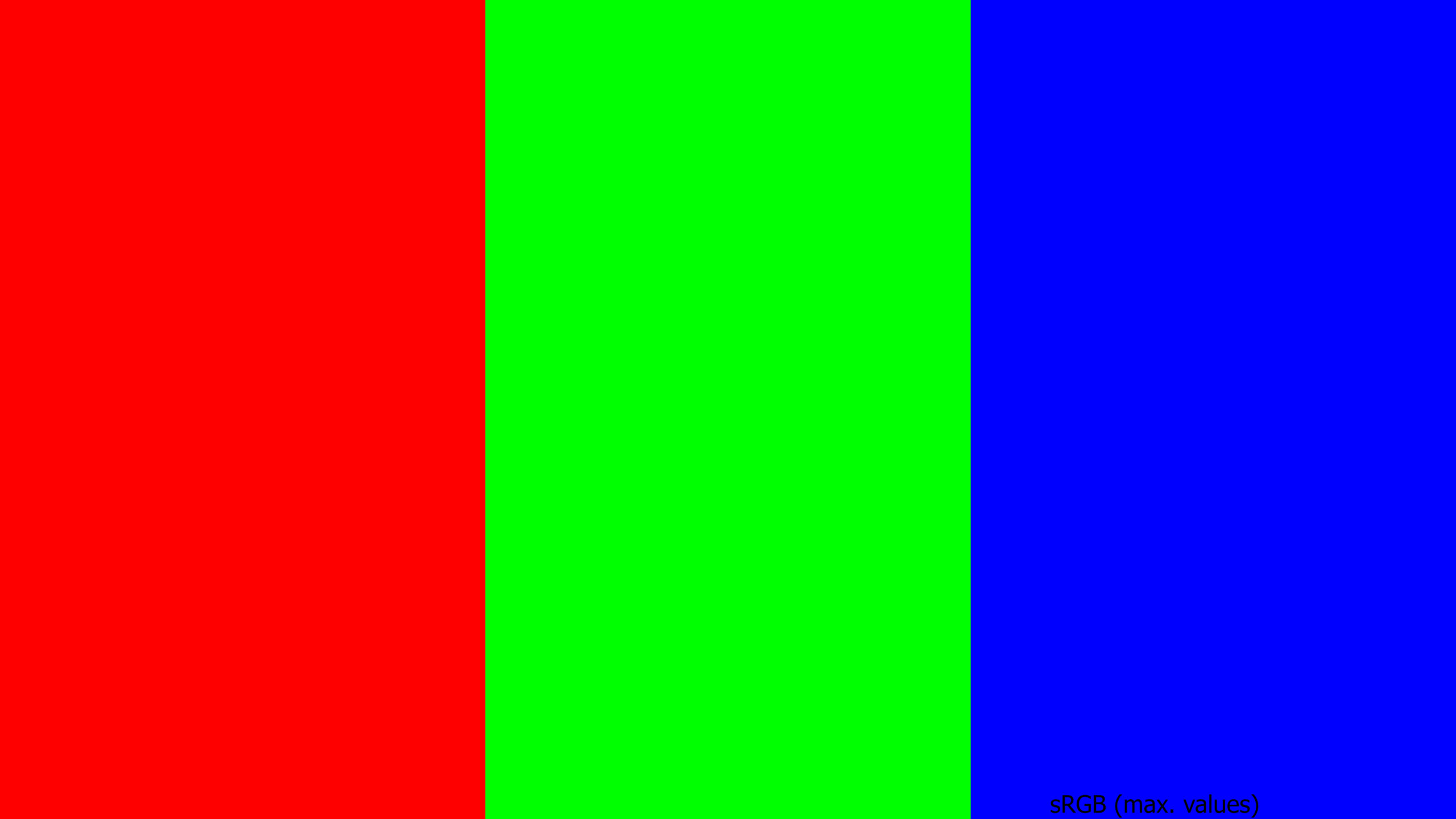
I set up the following two test images in Affinity Photo. The first one is encoded as sRGB and shows the maximum RGB values for red, green and blue as three bars.
The second image is created from the same document, but converted to Display P3. The three bars are still have the maximum values of the sRGB gamut, but not showing the maximum saturated primaries that Display P3 would allow. In Display P3 the three bars could be more saturated.
I used the text tool to write “P 3 RGB” on top of the three colored bars with the maximum RGB (Display P3) values.
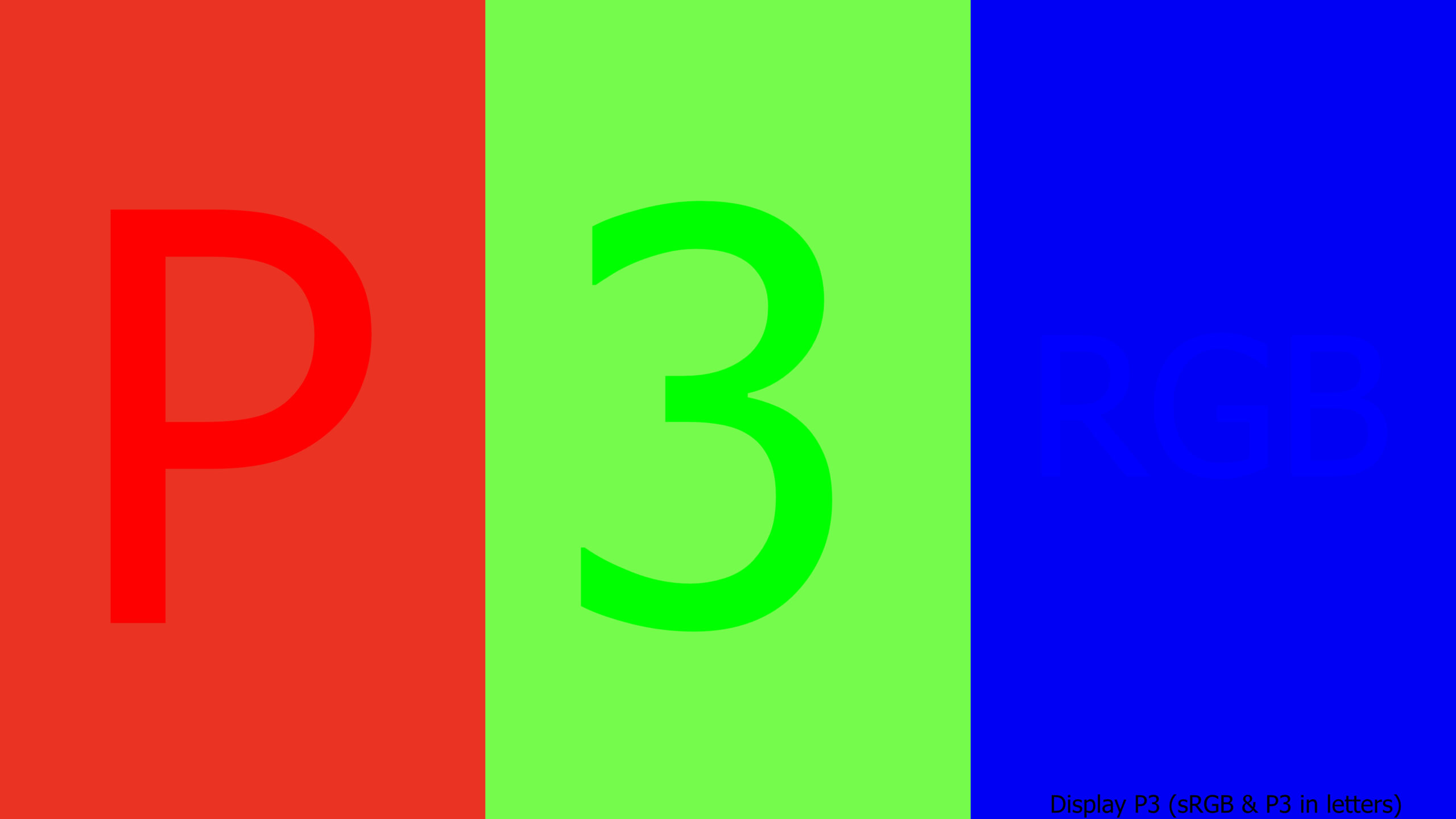
On my screen with Safari and Chrome I can read the letters and number “P 3 RGB” in the second image. In Firefox both images look identical.
Something “funny” happens when I stare at one of the letters or numbers inside one of the bars. The difference of chroma seems to fade away after a short while. And although both images show the same color bars, looking up from the Display P3 image to the sRGB image, the bars in the two images seems to have different levels of saturation.
The right display matters
Leaving standard sRGB displays and exploring a bigger gamut can lead to problems and misunderstandings. The moment you read this page on a standard sRGB display or the system and browser does not handle Display P3 wide gamut images properly, you won’t be able to see what I see.
But let’s move on… to HDR. I learned that from here the problems just getting bigger. For the next demo you need to have a 1000 nits display to view a proper result. The 2020 iMac 27″ display can only show 500 nits and is not able to display the “Red Star on Cyan” in 1000 nits.
Luckily I have access to three displays that show me the right result: An iPhone 13 Pro, and iPad Pro XDR and a 16″ MBP with an XDR display.
But before showing the HDR clip, here is again the clips from the end of the first article. There are at least two possibilities to break the smooth transition are between red and cyan when I exceed the display capabilities. Or maybe it’s better to say I send a wrong signal to display?
The result of sending a distorted signal to the display ends up with a white halo or a dark halo around in the transition area between red and cyan.
HDR – it gets bright! (if you see it right)
I found a way to scale the pixel values in the Nuke script, encode the signal as ST-2084 (PQ) and render out a clip from Resolve Studio in Display P3 (HDR) that counts up from 1 to 1000 nits.
On the iPad Pro XDR the YouTube video looks correct in the YouTube app, but the compression artifacts are a bit distracting. That’s why I added a link here to the original ProRes 4444 and a H.265 file. The H.265 file can be viewed on an iPhone or iPad directly as well of a number of Android devices.
https://my.hidrive.com/share/x9d-x54nff#$/
The Vimeo clip looks broken on the iPad Pro XDR in the Vimeo app. I clearly see all the time a white halo around the red star. But at least you can download the original file there too.
It took a while for me to encode the file in the right way and being able to see the desired result on a “proper” P3-HDR display. So what’s next?
Up to now I am dealing with well defined gamuts and the chosen color values are always inside (or better to say at the border) of chosen gamut. I started with the sRGB/Rec.709 gamut and moved on to the Display P3 gamut with two different EOTF’s.
In the next part I will to reach another display gamut: Rec.2020